标志 #5598
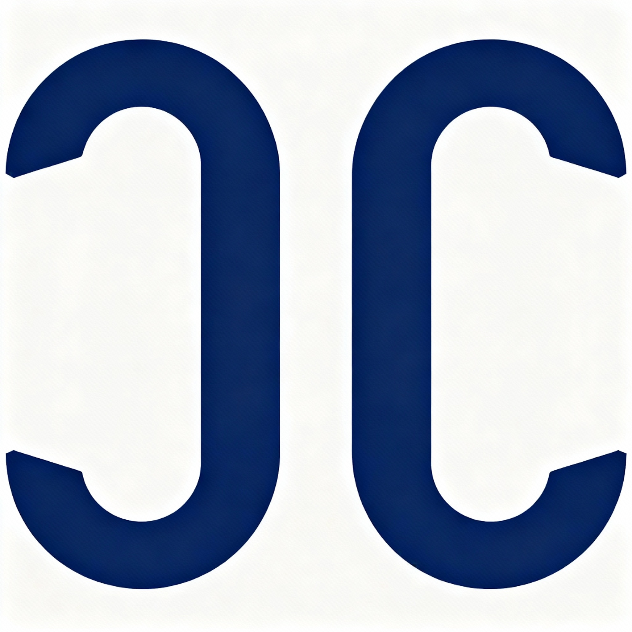
标志概念: This logo concept uses two identical, abstract geometric shapes, mirrored horizontally, to form a sophisticated pictogram. Each individual shape subtly references a stylized 'C', fulfilling the requirement for two 'C's conceptually. The inner tapering of the shapes, combined with the slight separation, creates a negative space that abstractly hints at the functional parts of a key, symbolizing access and exclusivity without depicting a literal key. The solid, very dark blue color against white ensures a calm, discreet, modern, and institutional feel, aligning with the luxury service brand's identity.
提示词: Design a minimalist, abstract pictogram logo for a luxury service brand called “Château Concierge”. Create a flat, symbolic mark made of two mirrored geometric shapes. The forms should subtly evoke keys and two letter “C” shapes conceptually, not literally. Do not draw real keys, rings, circles, glasses, locks, doors, castles, wine symbols, or decoration. Use one single solid color (black, very dark green, or very dark blue) on white. No gradients, shadows, gold, textures, or illustration. The logo must feel calm, discreet, modern, and institutional.