标志 #3882
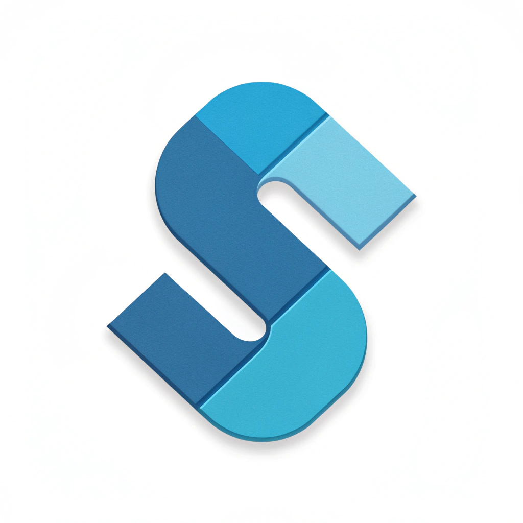
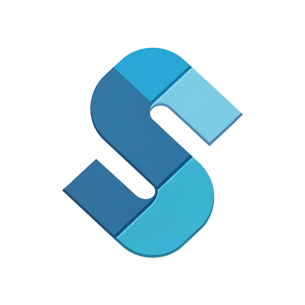
标志概念: This logo concept directly references 'SNet OS' through the prominent abstract 'S' shape. The segmented structure, composed of four distinct, flat pieces, draws inspiration from the multi-pane window idea of the Windows 7 logo, adapted for a modern flat aesthetic. Each segment symbolizes a component, module, or interconnected service within the operating system, reinforcing the 'Net' aspect of connectivity and integration. The harmonious blue color palette, progressing in shades, provides a sense of depth and professionalism without relying on 3D effects, making it clean and highly suitable for an app icon.
提示词: A operating System logo similar to window7 logo for the name “ SNet OS”, front facing, suitable to make as app icon
80 
图像变体 (1)

In the same style add “NET” beside the S logo in small size
已移除背景 (1)